![]()
Established in 1919, the National Restaurant Association (NRA), as its name implies, is the business association for the restaurant industry, representing more than 380,000 members in restaurant and foodservice outlets. The NRA?s mission is to ?lead America?s restaurant industry into a new era of prosperity, prominence and participation, enhancing the quality of life for all we serve.? It does this by providing tools and advice, advocating on its members behalf in Washington, D.C., and hosting the industry?s largest trade show, the NRA Show. Earlier this month, NRA introduced a new logo. Although no design credit was given they do mention in their press release that they ?sought input from industry professionals, state restaurant associations and policy makers to create a logo concept that resonates with a wide audience and that illustrates the restaurant and foodservice industry in multiple ways.?
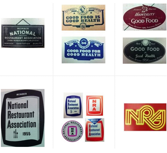
Previous logos over the years. Full timeline details here.
Harkening back to a previous logo, leveraging the circular elements of ProStart and ServSafe logos, and propelling us forward with the icon on the right, this logo enhances our relevance in today?s world. Its abstract form enables myriad industry segments to see themselves reflected in it ? from a pizza to the top of a wine glass, and everything in between ? and evokes our interconnectedness and spirit of hospitality. The use of blue and red allow for continuity from our previous logo, and a fresh, professional font emphasizes our impact on the industry. The arcs symbolize our representation of the entire foodservice industry and our commitment to being its trusted advisor. Their dynamism evokes the opportunity and success we will create for our members.
? Brand Guidelines
![]()
Video explaining where all the swooshes come from.
We have had a lot of good work this week and I would love to continue putting up winners but I need to meet my quota of bad work in order to have competitors vie for a spot in our end-of-year Worst list and I think we just found an elite in this category. I sort of feel bad for posting this work knowing that I?m going to skewer it and it?s going to get killed in the comments, but there really needs to be an end to logos that use a swoosh. More so for logos that use two. And even more dire for logos that build a whole rationale on swooshes. Unless you are a company that specializes in flights around the orbit of a planet, a swoosh is useless. They are boring to look at and although they can be assigned any number of press release superlatives they are meaningless and generic.
So it is especially sad to see a national association, representing hundreds of thousands of businesses redesign with a pair of swooshes in the twenty-first century. Given the amount of potential visual cues that exist in the restaurant industry, two swooshes that look like a dome lid serving tray is the least imaginative solution. But let?s assume swooshes are great and that this is best viable concept: The execution is relatively ? relatively ? decent, with swooshes that are properly built and typography that isn?t totally ugly; it?s hard to screw up centered Gotham all caps. The lock-up of icon and type is excruciating though, with the oversized swooshes hanging on the right, throwing the centered type completely off balance. In the end, I guess the logo could be worse. It could have used Helvetica.
Thanks to Jo for the tip.

Don?t forget to cast your vote about this post online

Brand New
Source: http://suckmypixels.com/a-swoosh-is-a-dish-best-not-served/
ufc 141 lesnar vs overeem appetizer recipes alistair overeem alistair overeem texas a m insight bowl
No comments:
Post a Comment
Note: Only a member of this blog may post a comment.